
Hi, I’m Aqib Ali — a UI/UX designer with over 5 years of experience helping websites and mobile apps (especially in e-commerce, fintech, health and conversion-focused niches) turn visitors into customers.
In this series, I’ll share practical tips on how small design changes can dramatically improve user experience and boost conversions — no fluff, just real insights from the trenches.
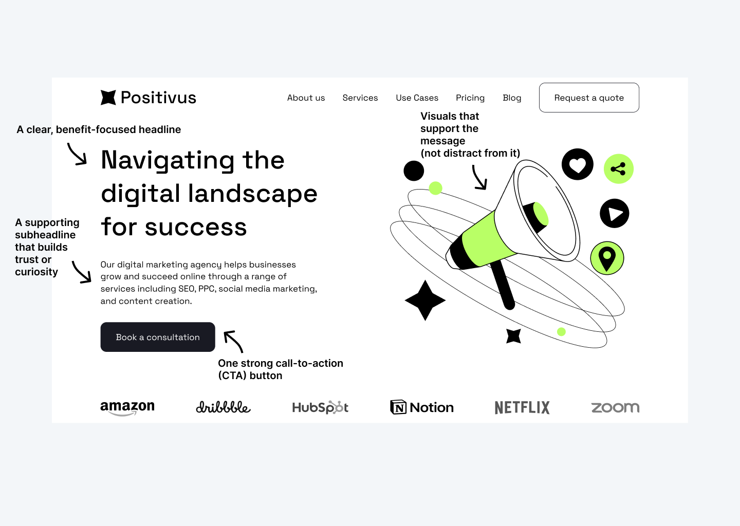
Let’s start with the very first thing most visitors see: website’s hero section.
The hero section (that big, bold area at the top of your homepage or landing page) is your one-shot chance to grab attention, communicate your value, and convince someone to stay instead of bouncing.
A strong hero section usually includes:
- A clear, benefit-focused headline
- A supporting sub headline that builds trust or curiosity
- One strong call-to-action (CTA) button
- Visuals that support the message (not distract from it)
When done right, it can lift engagement and conversions significantly — I’ve seen 30–100%+ uplifts in click-through rates just from refining this one area.
Here’s a solid example of an effective hero section in action:
Checkout the complete landing page here: Website Hero Section
What’s one thing you love or hate about hero sections on e-commerce sites? Drop a comment below — I’d love to hear!
Thanks for reading, and stay tuned for more actionable UI/UX tips.