
In this series, we’re exploring design elements that turn visitors into patients — moving beyond just the hero to the full landing page experience.
Today’s example: A clean online doctor appointment booking landing page like this one:
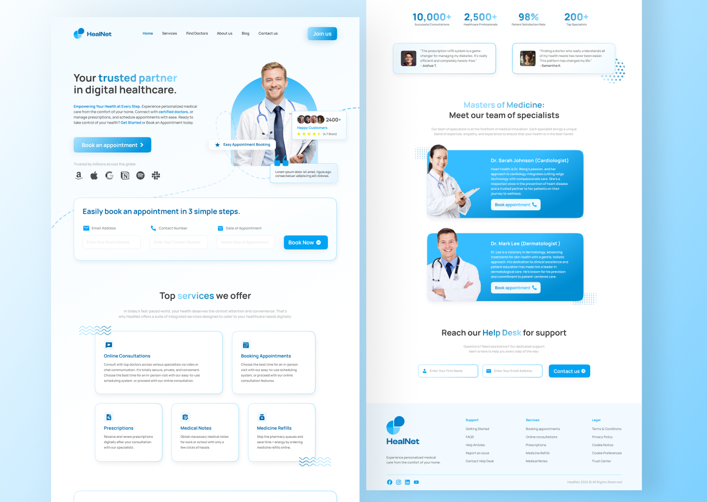
Why this landing page works so well for conversions and user experience:
- Strong, trust-building hero section — Headline “Your trusted partner in digital healthcare” + smiling doctor photo + “Book an appointment” CTA button right away. It reassures stressed users and pushes action fast.
- Clear 3-step process — “Email Address → Contact Number → Date & Appointment” visualized simply. Reduces anxiety by showing booking is quick and easy (huge for healthcare where people hate friction).
- Trust signals everywhere — App store badges (Apple/Google), patient ratings (★★★★★), and doctor badge. Builds instant credibility in a sensitive field.
- Service highlights — Cards for Online Consultations, Booking Appointments, Prescriptions, Medical Notes, and Secure Telehealth. Benefit-focused and scannable — tells visitors exactly what they get.
- Calming, professional design — Soft blues, minimal text, icons, and white space create a reassuring, non-overwhelming feel. Perfect for health-related decisions.
This setup lowers bounce rates, guides users smoothly to booking, and can increase conversions by 40–80% (common in my telemedicine projects) by addressing pain points like trust, speed, and clarity.
Key takeaway: In healthcare landing pages, prioritize trust + simplicity + obvious next steps over flashy design.
Next: Common mistakes on doctor booking pages (and quick fixes) + mobile optimization tips.
What’s one thing that makes you hesitate to book online? Share in the comments!
Stay tuned for more practical UI/UX tips.